THE FOUR Cs OF Effective Point-Of-Sale Signage
THE FOUR Cs OF Effective Point-Of-Sale Signage
By Jennifer Henderson
We expect signage, both digital and print, to do a lot of heavy lifting for us–tell customers what to do (and not do), push products and services, including upselling and cross-selling, and reinforce our brand in their mind. Creating high-impact, memorable, effective signage that spurs action and cuts through visual clutter is as much a science as it is an art, which means that it can be broken down into a number of tried and true principles. To that end, here are the four Cs or key factors to consider when creating point-of-sale signage that drives results.
Concise
When it comes to content on signage, less is more. To quote Paul Rand: “A good designer knows how to put information into the design; a great designer knows which information is not necessary.” Whether you’re trying to capture people’s eye while they’re pumping gas, standing in line at a register, or waiting to use a pay station, you can’t count on having more than a few seconds of their attention and it may not be undivided. Opt for clear, bold visuals and minimal text, just enough to get your message across. Think of the simplicity of a STOP sign, a banner that reads OPEN draped across the front of a new restaurant or the image of a cigarette with a red line slashing through it. They’re all clear, concise and easy to interpret.
Contextual
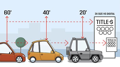
Signage doesn’t exist and shouldn’t be designed in a vacuum. What matters equally to the content of the sign is the context in which it will be viewed. How close will the customer be to the signage? Will they be looking at it from their car? At what time of day are they most likely to be seeing the sign? What else will they be doing at the time? What other signs or objects will be competing for their attention? Context informs content and design. For example, the number of legible words you can fit on a sign that’s going to be read from 10 feet away is greater than the number you can fit on a sign that’s going to be read from 20 feet away. Signage that is meant to drive an upsell should be visible as the customer is waiting to pay to give them time to contemplate modifying their purchase, but it shouldn’t distract from the purchase process itself. You can’t separate a sign from its context.
Cohesive
Signage is a key component of overall branding, and as such influences the brand perception of your customers. Your goal should be to create a cohesive visual brand and messaging across all channels on which buyers interact with you. Your website, social media, digital ads, print collateral and on-site signage should feel part of a unified whole that is not only uniquely you, but that gives customers a sense of comfort and familiarity as they interact with you. Colours, typefaces, visuals and messaging should all be on-brand and not compete with each other or other elements around them.
Compelling
Effective POS signage drives the customer to take a single action, which makes it critical that you identify the goal of your signage and align its design and content accordingly. Are you promoting something? Are you trying to prime customers for a particular behavior? Are you communicating information to educate them or shape their behavior? No matter what you want from your customer, you need to create your signage with that end goal at the forefront of your mind. Remove any and all extraneous elements. Arrange your information in a clear hierarchy–your call to action should be unmissable, everything else can fade into the background. Use high contrast to draw the eye, but limit typefaces, icons and supplemental visuals to only those that are absolutely necessary, which is often fewer than you think. You’re building an urgent, irresistible customer beacon.
Effective signage doesn’t just look good. It informs, educates, compels and, most importantly, sells. Creating point-of-sale signage that shapes customer behavior is often an iterative process of exploring what works or doesn’t for the audience you’re trying to reach. By keeping the four Cs in mind, you’re well on your way to driving results with concise, contextual, cohesive, compelling signage.
Jennifer Henderson is an account director at Suds Creative, the only marketing agency dedicated exclusively to data-driven revenue optimization for carwash industry clients. She can be reached at jennifer@sudscreative.com

