Blueprint to Foodservice: The science behind store layout and foodservice success
COMMON STORE LAYOUTS
RID
A predictable pattern of long aisles with end caps, where customers browse up and down rows and rows of product. This layout works well for stores with lots of merchandise but has the potential to crowd aisles.
HERRINGBONE/SPINE
An ideal layout for long, narrow retail spaces. However, this layout limits visibility if shelving is high to maximize the space and can create a sense of cramping and high risk of theft.
LOOP
A pattern that deliberately drives traffic in a certain direction, maximizing product exposure but limiting a browsing experience.
FREE-FLOW
The simplest of layouts, encourages customers to flow freely through the store. While this layout is most common with small, specialty stores that have high impulse purchase patterns, it has the potential to create some confusion between sections of product and wasted space.
Meline Beach is a Toronto-based communications practitioner and frequent contributor to Convenience & Carwash Canada. In addition to freelance writing, she provides communications and public relations support to businesses across Canada. She can be reached at www.mlbcomms.ca
Blueprint to Foodservice: The science behind store layout and foodservice success
Do you recall your last trip to IKEA, Lowe’s or Costco? Many of these traditional retail centres offer a foodservice component to their customers – separate and away from shelved merchandise.
As more c-stores consider foodservice as a growth opportunity, design, décor and store layout are important success factors. There’s a lot we can learn from big box stores who spend small fortunes on analyzing customer shopping patterns, traffic flow and floor space.
Convenience & Carwash Canada spoke with the following two consultants on effective store layout options for c-store foodservice success: Duncan McArthur, Convenience & Petroleum Consulting and Jenny Companion, vice-president – Eastern Operations with The Fifteen Group, Hospitality Management + Consulting. We boiled down our findings to five key steps.
1) Consider your c-store ambiance and ease of navigation.
A combination of environment and experience builds a loyal customer. Research indicates that people move in predictable patterns and often to the right upon entering a store. As a result, this, and all directions, should be clean, clear and free of clutter. How ever your aisles are arranged, be it grid, herringbone/spine, loop or free-flow, your pathways should allow for easy foot traffic, with floors free of product. Customers should have enough personal space for to bend over, pick up product and pass by one another. A general rule of thumb is to have your aisles three to four feet wide to allow for a comfortable browsing experience.
In an effort to enhance a customer’s experience, Companion suggests offering seating for on-site eating and free wifi. “This will encourage customers to spend more than normal time in the space and be exposed to all of the food offering and convenience items.”
However, McArthur points out that there may be regulatory/licensing requirements for on-seating arrangements, and if seating cannot be accommodated for a reasonable number of customers (15-20+), then, “you ought not to consider it.”
Overall, your store’s ambiance should make the best first impression.
2) Ensure appropriate lighting, marketing, signage and promotion to help steer people in the right direction.
While it is not suggested you use arrows on the floor to guide people in the direction you want them to move (like IKEA does), bright lights and appropriate signage will let your customers know where to go. If you have an on-site counter for foodservice preparation, it might make sense to hang signage from the ceiling letting people know where to go to place an order, pick up an order or prepare their hot or cold beverage. As c-stores should have their foodservice counter tucked away from the door, it won’t help anyone if it’s not obvious as to where it’s actually located within the store. On that note, Companion states, “Signage and photos showcasing food are really important in catching the customer’s attention and interest.”
McArthur adds, “Visualize your own shopping experiences, regardless of the channel… how do you feel about navigating multiple product displays, many without proper signage, or cluttered aisles. Compare that experience where lighting is clean and bright and displays are neat and well marked. Customers will return to a location where their needs are met in a clean, safe environment, with the ability to make impulse/incremental purchases without feeling bombarded by multiple messages.”
Also, perhaps as a value-added option, McArthur points out that marketing or promotional dollars might be available from the manufacturer to highlight their product name or brand. “This could include signage (digital and/or print) point of sale materials, and possibly discounts on specific types of equipment. Whatever you decide, ensure your decisions are based on customer needs, rather than rebates or incentives.”
3) Keep displays, equipment, and on-site foodservice preparation well-maintained and visually-appealing.
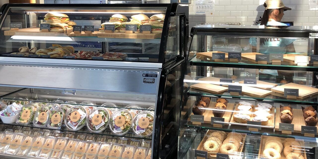
Foodservice displays, equipment and preparations attract instant attention and as a result, should be kept clean, well stocked and in excellent working order.
“A successful foodservice program must offer consumers a quality product, fairly priced, in an ultra-clean environment, and be easily communicated.” McArthur adds, “Look around at the food service organizations that are best in class – how do they execute their program(s), what type of cleanliness standards do they employ, how do customers move from station to station (paypoint, food delivery, condiments, etc.)?”
Consider product rotation, managed inventory and product freshness on a regular basis. Selling items beyond their best before date will not entice a customer to purchase from your store again. Counters should be kept clean of spills, drips and stains and foodservice items, including condiments, should be maintained at appropriate temperatures.
“Regardless of your foodservice offering, you must keep your equipment clean, in good operating condition and current,” says McArthur. “The consumer perception around out of order signs is negative, and a sure way to ensure not just a lost sale, but potentially a lost customer.”
Companion adds, “Some food handling in sight of the customer is important; it impresses them that the food is fresh and not out of a package. Printed menus in the foodservice area and in grab-and-go fridges allows customers who don’t have the time to wait the opportunity to quickly read what’s available and grab something on the go.”
4) Position products to maximize exposure and help enhance impulse purchases. Consider food samples, foodservice snacks and low-cost impulse buys near the register to encourage a quick grab-and-go sale. Know your go-to items that sell frequently and place them near the back of the store to encourage shoppers to pass by other items and promotional displays.
Companion suggests, “Retailers should design their store layout in a way that has customers lining up beside grab and go and display refrigeration to encourage the impulse buy.”
5) Scrutinize your store checkout and foodservice areas. If research indicates that foot traffic veers to the right upon entering a store, you might want to position your checkout area to the front left, to encourage people to shop the aisles before making their way to the cash register. As a reminder, Companion states, “Food handling needs separation from regular service and cash-handling, ideally with room for proper food preparation and dishwashing.”
Overall, McArthur encourages retailers to start with a well thought out plan. “Ensure you have support from vendors and suppliers, and only do what you believe you can do well.” McArthur adds, “Expanding your foodservice offerings will be met positively by your customers – reducing them may cause them to question your ability to meet their needs in other areas of your site as well.”
The ultimate goal for any C&G retailer is to drive foot traffic and build loyalty. A plan for an effective store layout that steers traffic in the right direction, enables customers to make their way to the foodservice section where they can make informed decisions based on what is clearly communicated, and complete their transaction in an easy and timely manner will make all the difference.

